

CTM identity
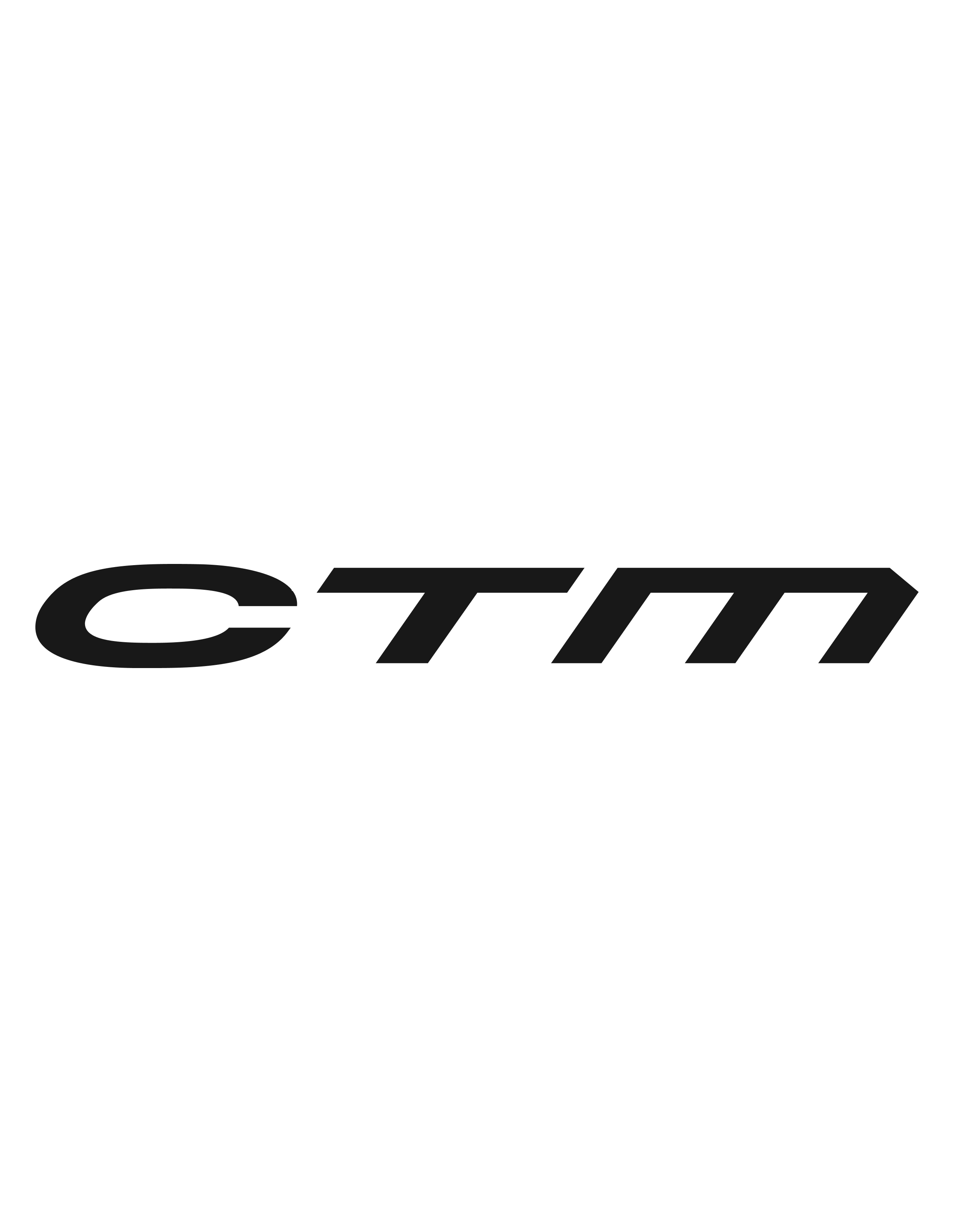
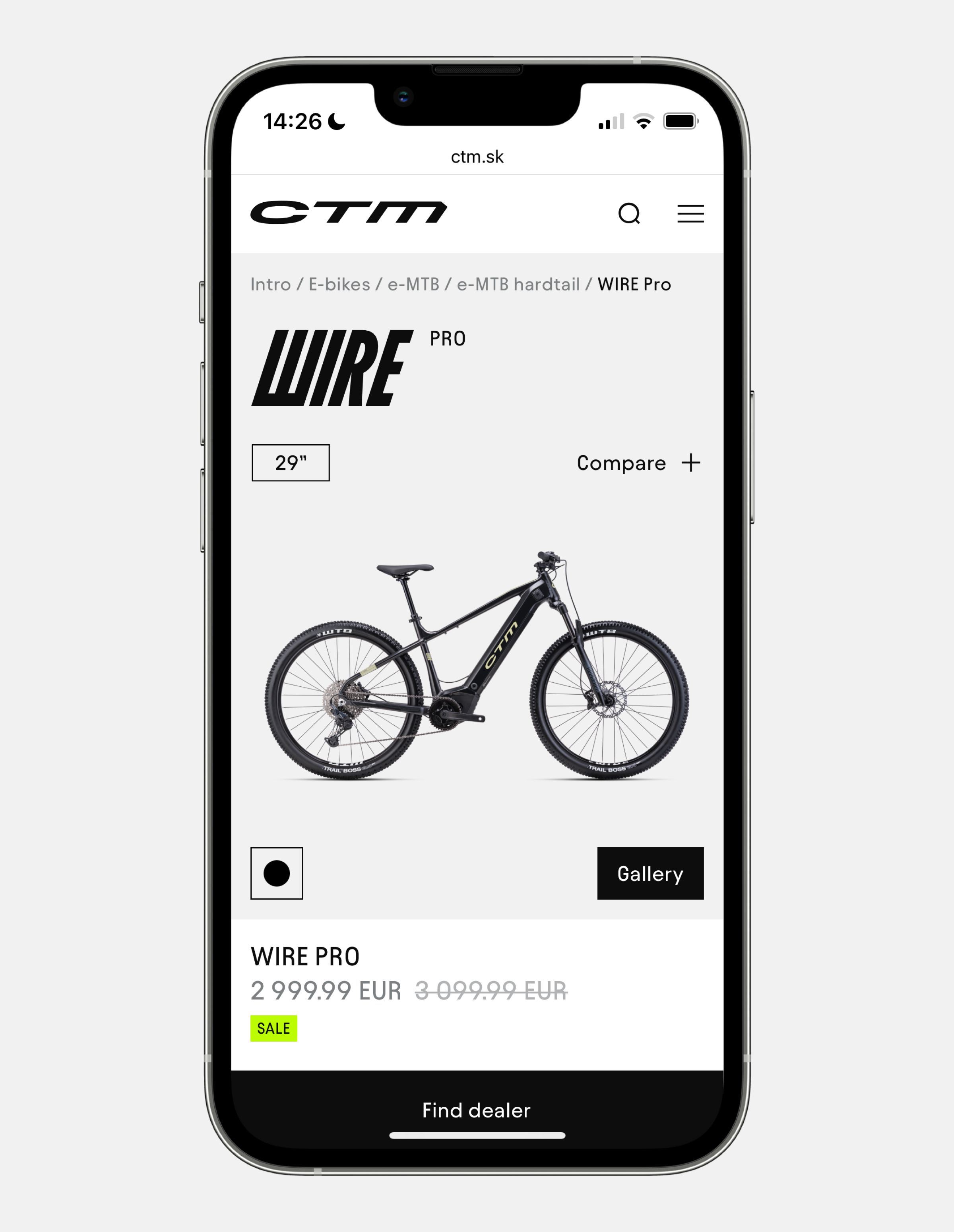
Visual identity for a local cycling brand. We created a new brand identity for CTM, a locally well-known cycling brand with 30 years of history. We re-designed the core identity and helped establish it through collaborations on various projects over the span of several years, maintaining their new visual language in both online and offline communication across different channels. The re-design featured a new logotype, a refreshed symbol and custom typography in three different typefaces; referencing the three pillars of their products: C for City, T for Terrain and M for Mountains. www.ctm.sk
Client: CTM
Deliveries: visual-identity, packaging-design, web-design, web-development;
Logotype and visual identity: A. Barčák, A. Čanecký, M. Kahan;
Typeface: M. Čuban;
Photo: M. Moravík;
Related projects
Menu
Office
ID 50232495, TAX 2120234633, VAT ID SK2120234633
business inquiry: martin(at)khn.sk, 00421-902-360-768
all rights reserved
©2025 khn office
